Examples
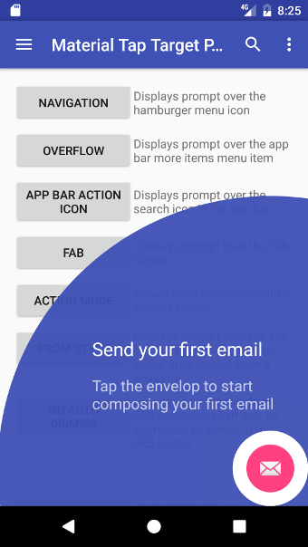
Below are a variety of common use case examples. The bare minimum required to show a prompt is the target view and either primary or secondary text, as can be seen in the first view example. Each example is implemented in the sample app with the source available here
View

Any view can be targeted by either supplying its id or the view object.
Id:
new MaterialTapTargetPrompt.Builder(this)
        .setTarget(R.id.fab)
        .setPrimaryText("primaryText")
        .show();
View object:
new MaterialTapTargetPrompt.Builder(this)
        .setTarget(findViewById(R.id.fab))
        .setPrimaryText("primaryText")
        .show();
App Bar

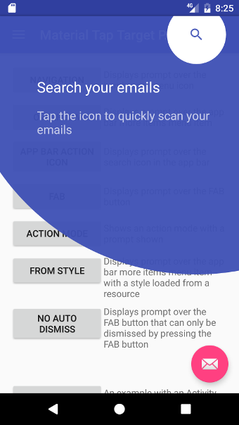
An item that is showing in the app bar with an id and not in the overflow drop down menu can be targeted.
In the menu xml file the item will look something like below with the id set:
<menu xmlns:android="http://schemas.android.com/apk/res/android"
    xmlns:app="http://schemas.android.com/apk/res-auto">
    <item
        android:id="@+id/action_search"
        android:icon="@drawable/ic_search"
        android:title="Search"
        app:showAsAction="always" />
    <item
        android:id="@+id/action_settings"
        android:orderInCategory="100"
        android:title="@string/action_settings"
        app:showAsAction="never" />
</menu>
The settings item can not be targeted (as it is in the overflow).
To target the search item supply the id to the setTarget method:
builder.setTarget(R.id.action_search);
To display the target correctly set the displayed icon or set the background to transparent:
builder.setIcon(R.drawable.ic_search);
Full example:
new MaterialTapTargetPrompt.Builder(this)
    .setTarget(R.id.action_search)
    .setPrimaryText("Primary text")
    .setIcon(R.drawable.ic_search)
    .show();
Recycler View Card

First get the card view. In the example below a LinearLayoutManager is being used on a RecyclerView:
LinearLayout card = (LinearLayout) mLinearLayoutManager.findViewByPosition(0);
Once the card view has been obtained, find the associated ViewHolder. Replace the CardAdapter.ViewHolder class with your own.
CardAdapter.ViewHolder viewHolder = (CardAdapter.ViewHolder) mRecyclerView.getChildViewHolder(card);
With the ViewHolder it’s child views can now be targeted:
builder.setTarget(viewHolder.mImageView);
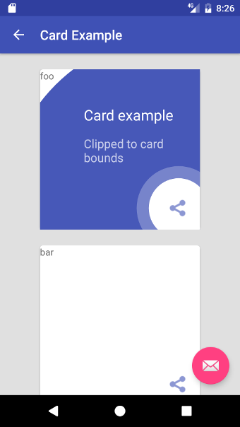
An additional step is to clip the prompt to the card views bounds so that it is not drawn outside it:
builder.setClipToView(card.getChildAt(0));
Full example:
LinearLayout card = (LinearLayout) mLinearLayoutManager.findViewByPosition(0);
// Check that the view exists for the item
if (card != null)
{
    CardAdapter.ViewHolder viewHolder = (CardAdapter.ViewHolder) mRecyclerView.getChildViewHolder(card);
    new MaterialTapTargetPrompt.Builder(this)
            .setTarget(viewHolder.mImageView)
            .setClipToView(card.getChildAt(0))
            .setPrimaryText(R.string.example_card_card_title)
            .setSecondaryText(R.string.example_card_card_description)
            .show();
}
Centre

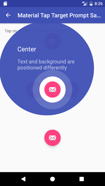
The prompt size will automatically be optimised to be positioned off centre from the target when the target is over 88dp from the screen edge.
Primary & secondary text style
A SpannableStringBuilder can be used to customise how text is rendered.
SpannableStringBuilder primaryText = new SpannableStringBuilder(
    "Send your first email");
BackgroundColorSpan backgroundColour = BackgroundColorSpan(
    ContextCompat.getColor(this, R.color.colorAccent));
primaryText.setSpan(backgroundColour, 0, 4, Spanned.SPAN_INCLUSIVE_INCLUSIVE);

SpannableStringBuilder secondaryText = new SpannableStringBuilder(
    "Tap the envelope to start composing your first email");
ForegroundColorSpan foregroundColour = new ForegroundColorSpan(
    ContextCompat.getColor(this, R.color.colorAccent));
secondaryText.setSpan(foregroundColour, 8, 15, Spanned.SPAN_INCLUSIVE_INCLUSIVE);

new MaterialTapTargetPrompt.Builder(this)
    .setTarget(target)
    .setPrimaryText(primaryText)
    .setSecondaryText(secondaryText)
    .show();